Very excited to have photos of my cd packaging that I turned in to ADCD. I didn’t do as much as I wanted to, which is a little sad. But I was also very happy to take a break.
concept: I created a compilation CD that can be played whether you’re having a good day or a bad day, but not matter what I hope that my CD can help you have a better day. The songs that I chose are all similar, even if they evoke different emotions. The songs all have to do with either the time of the day, or weather imagery to relate to my packaging.
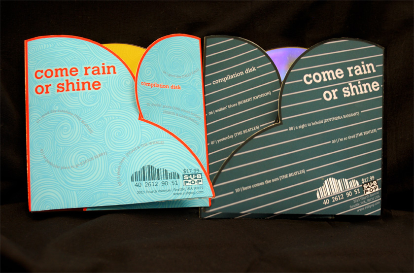
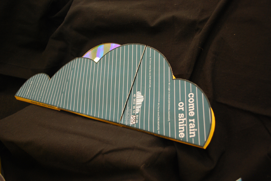
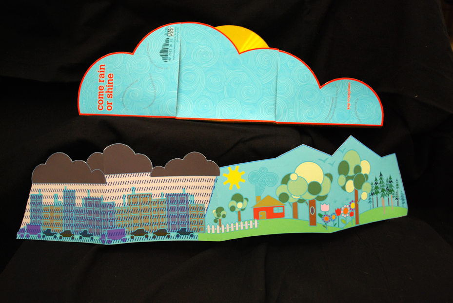
The packaging is double sided, one side for a “rain day” and one side for a “sunny day.” The package opens from the sides to make a cloud. The booklet I created for my CD includes a short blurb about the concept and the tracks listed as times of the day. On the reverse side are scene from a “good” and “bad” day, which I image the cloud CD packaging looking nice above. The CD itself, of course, looks like either a bright yellow sun or overcast, depending on which side you’re holding the package from.
NOTE: My actually CD is light-scribed with the swirl-line pattern as well. Unfortunately, I can’t take a good picture of something so shiny. There is also a clear plastic slip that goes around the CD which is not included in the photos.

^ both sides of the CD


^ Close up of rainy day

^Sunny day over booklet


^Inside of booklet
One of the other graphic design students said that black backgrounds are going out of style and look outdated. She said all new portfolios are being done with a white backdrop. I feel like good contrast doesn’t really go out of style. Any designers out there—What are your thoughts? I know The Dieline has white backgrounds…
Ps. I made the swirls myself. I just want to mention it because it took SO LONG! 🙂

Update: Evan says both my black background and photography skills are “tragic”. So now you know.