Last week was another doozy. I barely had my computer for most of it, which is pretty atypical.
As you may have seen my metaphorically prancing about on social media outlets, last week I had the good fortune to attend a lecture by Charles S. Anderson through AIGA Colorado. I first heard about him from I had a class project to create website about famous designers and one of my classmates had him (and made a great website), so I was more than a little giddy that I would get to see him talk. I was mostly familiar with his work for the French Paper Company (that is not actually French, I learned, it’s just the founder’s last name. They’re from Michigan). Other than that peripheral knowledge, I didn’t know what to expect. I didn’t even know what he looked like.
My expectations: That he’d be an eccentric-but-nicely-dressed man of gentle disposition who gave off an air of quiet intelligence and kindness. Ok, to be completely honest: I 100% imagined him to look and act like Ira Glass.
The reality: Anderson had a young-dad type look. Jeans, casual two-button shirt, and a comfortable windbreaker. Close-cropped, blonde hair that was longer on top than the sides and a styled with a little bit of product. Basically 80% of guys I see. (He didn’t even have glasses!)
Because I only knew of his work with the French Paper Company I associated him with clean, beautiful, complex, and classic design. It’s modern, but draws from so many of the dregs of letter press printing. I had a vague notion that he would be or was the star of some super hipster vimeo about craft, quality, and design who would constantly expound the need for us to revert back to a simpler time, etc., etc., etc.
Instead, Anderson is an extremely laid back and had this boyish curiosity that I didn’t know about his work. “Curious” in a mischievous and/or mostly nonsensical way, that is. I absolutely adored the spectrum of his work. He has a love for what he calls “low-brow” pop art.
He showed us numerous examples of work that his studio created that were “just for fun” or a “good idea for the future but that isn’t marketable now…” and example of projects that seemed crazy at the time, but were now common place (stock photos, custom t-shirt printing). I just loved their exploration of pop culture so much. The design just displays such a great amount of both shear talent & beauty paired with humor & whimsy.
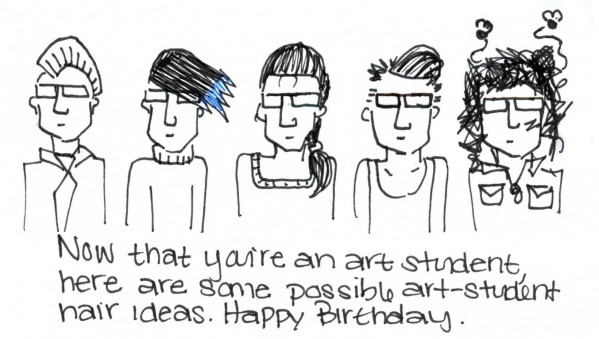
Basically, I really loved it. I don’t know if it’s true or if I’m just kidding myself, but every time I see someone’s work I admire I think: “That’s me! I do that! I like playing around with things! I like making jokes! We’re the sameeeeee!” It probably has to do with the fact that I do things that I like and so when people do things that are similar, it follows that I would like them too. For instance, there is something that I deeply love about Marc John‘s work. Take a look and then look at this birthday card I just made for my friend:

What do you think? Not necessarily the art itself, but isn’t there just some core shared-nonsense about our work?
Back to Anderson though…his lecture as a performance wasn’t extraordinary, but the content of it was so sincere that it more than made up for it. He wasn’t trying to sell himself, you could just tell that he cared about what he did. He discussed his personal history and went though many specific examples of projects he’s completed with his company to show-not-tell what he values. His Q&A was particularly good.
One thing that stuck with me was his emphasis on thinking about design as product. As designers, we’re not creating work that should be paid by the the hour. We’re pouring our experience and creativity into designs that are meant to last years. This topic was very apt as I was just discussing the price of logos with my friend Grant. The logo is a company’s image, it’s meant to be used for as long as the company is trying to convey X message about itself. It’s an asset for the company just as much as a good location is. It’s much more than just X hours spent working in the studio and refining designs online. You’re giving them something they’re going to use over and over again.
Basically, it hurts the whole design industry when people (like me) sell themselves short and undercharge for their work. It perpetuates the idea that design work should be X price and then the general public will expect it to be that (low) price. Grant of course didn’t understand at all and when I asked him he said “I don’t know, $100?” UGH! Sarah also brought it up that most of the people don’t appreciate the work that goes into custom design & construction of costume design too. (Echo that!)
I have started charging a little bit more for my work, but it’s still very difficult and sadly under market rate. It’s a balance between believing in my self-worth and accommodating client’s needs, especially if they’re a non-profit. But I can’t let Charles S. Anderson down!
Finally, to perhaps sum of the experience (perhaps not) here is the video that Anderson closed with called Control Master:

Can I also note that we were given free samples of French Paper prints and, since I didn’t know who any of the people were, I was ungraciously grabbing different ones in front of Mr. French and I think maybe even Charles. I was mortified after I found out. I couldn’t believe that we give away such beautiful prints, but, for the record, I also love avoiding eye-contact.


